
A Closer Look at Color
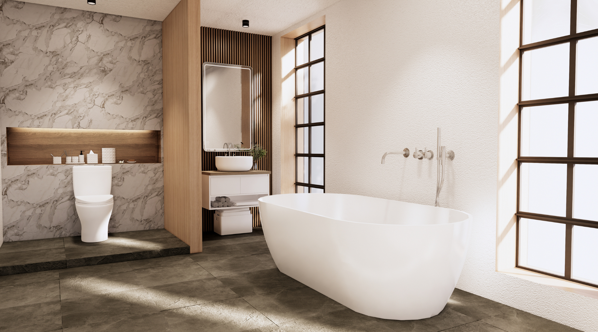
Planning out what you want a remodeled kitchen to look like can be challenging. There’s no need to stick to black, white, or neutral tones. You can have fun with color as long as you understand some color rules.
- The Color Wheel Basics

Warm and Cool Colors: Warm colors include reds, oranges, and yellows. These colors are indicative of happiness, excitement, and urgency. Cool colors include purple, blue, and green. The cool colors reflect calmer emotions along with trustworthiness and professionalism. Knowing this, you can decide what type of “vibe” you want your kitchen to have.
Complementary Colors: Colors that are complementary to one another are located exactly opposite each other on the color wheel. The contrast of the two colors works well, and these colors are often seen with each other.
Analogous Colors : These are colors that sit next to one another on the color wheel such as green, blue-green, and yellow-green. Platelets with analogous colors mesh well together and can keep a consistent vibe throughout a room by remaining in either the cool or warm side of the color wheel.
For a deeper dive into Color Theory, check out this article: https://bsyl.ink/ColorTheory.
- Psychology of Color.
Each color causes different reactions in our brains when we see them. Each means something different, and these hidden meanings should be taken into account when remodeling.
Red : Raises the energy in a room and can cause excitement and elevated blood pressure.
Blue: Is seen as calm and serene and lowers blood pressure. It can also indicate trustworthiness.
Green: Considered the most restful color for the eye. Green is the most relaxing color when featured in a room, and cools things down while still promoting warmth and togetherness.
Yellow: Energizes and uplifts. It is great for a kitchen where we want to bring the sunlight inside and promote coming together to have a good time. However, yellow in too great amounts can cause frustration, anger, and loss of temper so use it wisely.
Orange: evokes excitement and enthusiasm. Orange is not great for any room where you will want to relax but can be nice in a workout room or a child’s playroom.
For more detailed explanations see here: https://bsyl.ink/HowColorAffectsMood
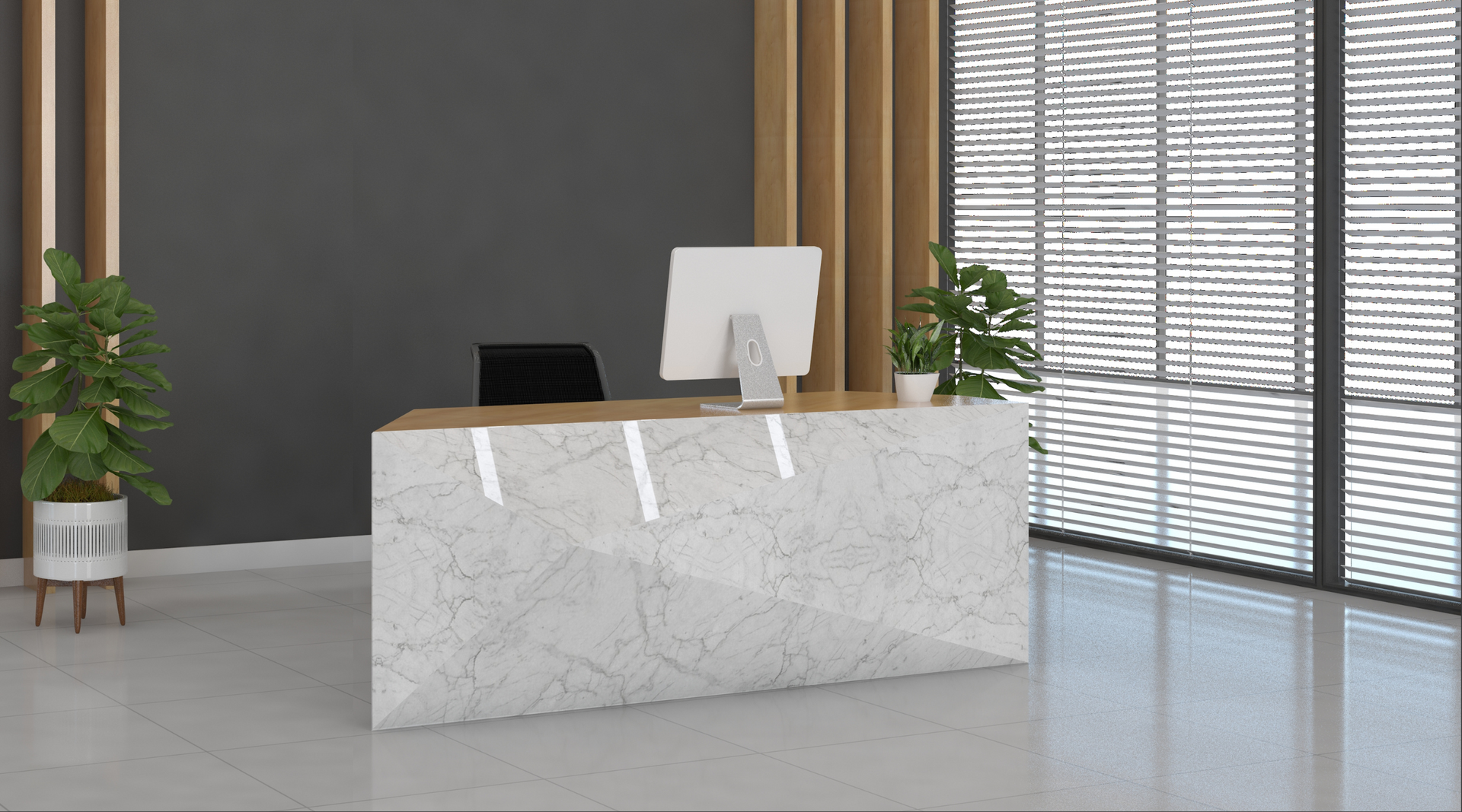
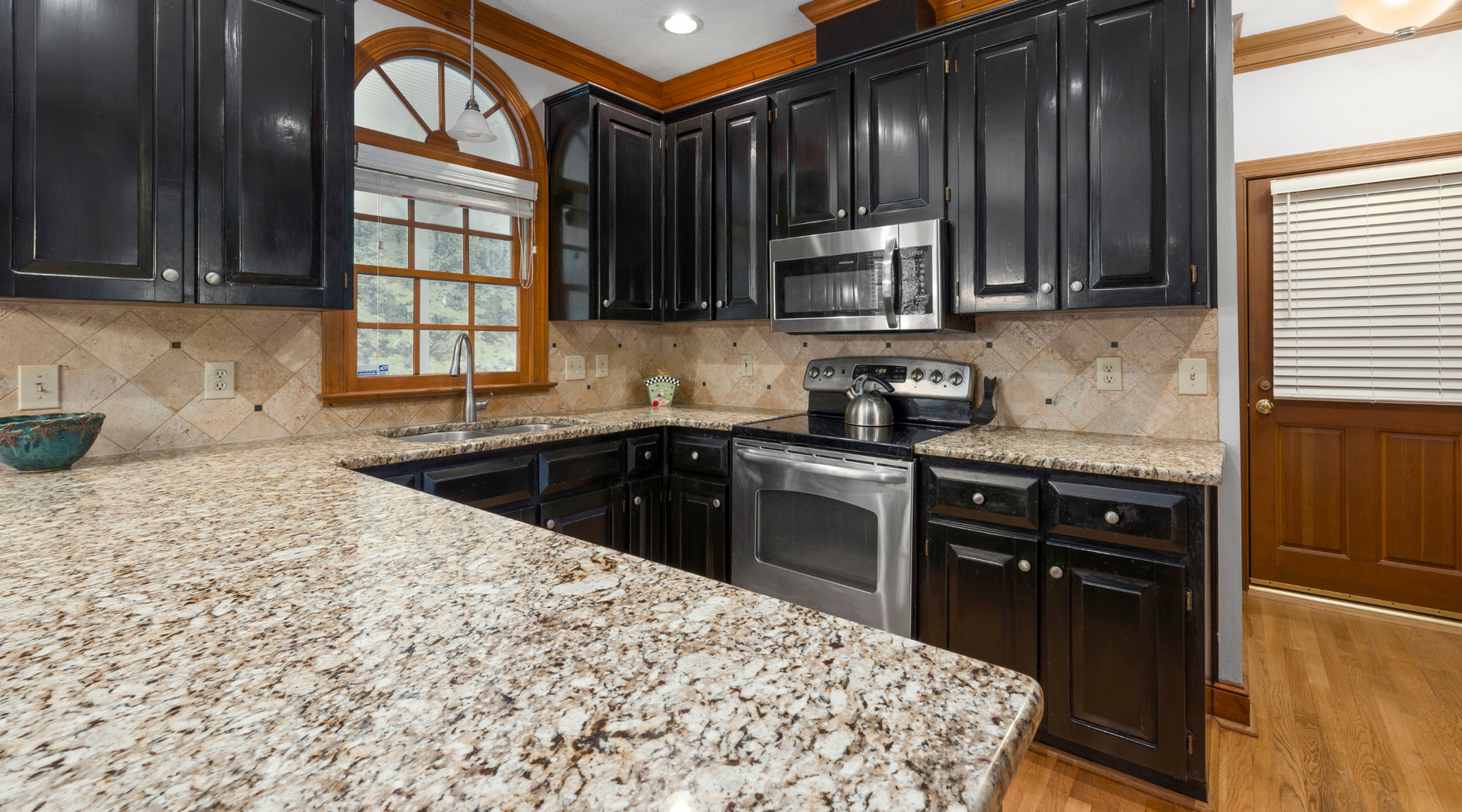
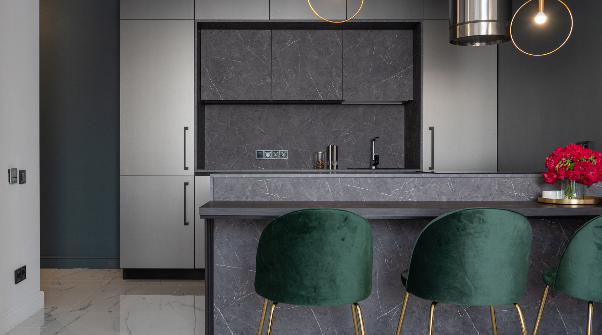
There’s a lot more to choosing a nice color than your preferences. While that is important, you should also pick colors that work well together and create the type of atmosphere you are looking for. No matter what color you choose, Planet Stone has a countertop that will look great with your newly-painted kitchen. See our selection and create a virtual kitchen with the colors you choose here: https://bsyl.ink/PS-VirtualKitchen